Georgie Kennett
Professional Identity


Colour Branding
In order to create a brand style that reflects my personality I began brainstorming with my graphic designer who was creating my logo for me to figure out exactly what I was looking for and what colour scheme would be best to use. I do have a favourite colour and it is green, I wear so much khaki and neutral clothing practically every day and my friends suggested I focus my branding around that colour because they all know me for the way I dress and obsess over khaki items. I did not consider it at first but the more I thought about it the more it appeared suitable to represent me. So I began justifying my choice.
Colour Choices


Orange: Fun, warmth and enthusiasm.
Yellow: Cheerful and optimistic.
Red: Designers use red in high-energy context; often to convey a sense of urgency or boldness.
Silver: Sophistication, class, with a little bit of mystery around it.
Pink/Purple: Feminine, fun, youthful – frequently used to promote beauty products.
Green: Good, healthy, organic – and can be used to convey relaxation, nature or environmental issues.
Black: Elegance, boldness, power, sophistication.
The colour blue, which conveys honesty, trust and dependability. Blue is often used in logos.

Personal Branding

There was no real other colour that stood out to me, I did consider using silver and white keeping it minimalistic but my graphic designer said it would be similar to hundreds of others. This swayed me more towards the khaki colour because I trawled the internet and did not find one khaki themed business card, which is great because I know the chances of someone having the same colour scheme as me and layout is pretty slim.
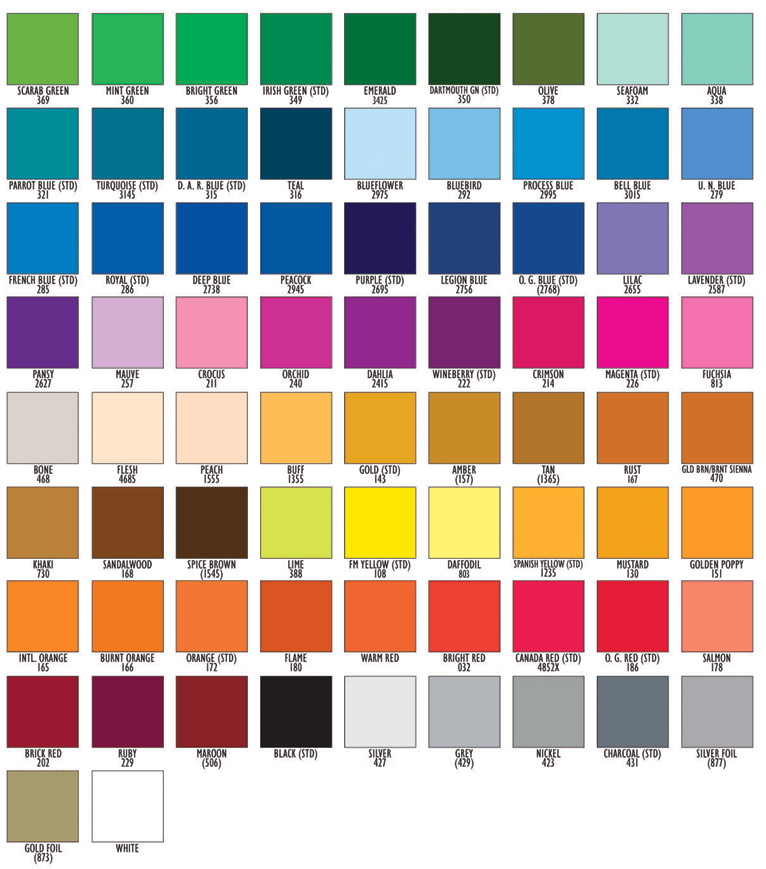
Below is a refined version of the colour charts I then focused on, the one directly below appealed to me the most because those are the colours I wear so frequently. There was also other earthy pastel tones in the chart which was interesting and we did discuss the colour together. I went with what I had been thinking and she began designing my khaki business cards and logo.


Colour Charts and branding reference: Adolphson, L. (2015) KRAZY ABOUT KHAKI. Available at: http://www.louiseadolphson.se/krazy-about-khaki/ (Accessed: 18 December 2015).
Appy (2015) ‘Why the right color palette matters for your brand’, Available at: https://www.addthis.com/blog/2015/08/18/why-the-right-color-palette-matters-for-your-brand/#.VxYgnzArLIU (Accessed: 19 November 2015).